HTML help please

Captain Code

Moderator
Staff member
Mod
Can someone please take a look at
this
and tell me why the border of the table isn't tight with the images at the top?

All the other pages have the same format, and the table border goes right around the images without any space.

I've looked through the HTML many times and can't see the problem with that one page.

IE(OSX) displays the page correctly for me, but the windoze version doesn't and neither does any build of Mozilla/Chimera/etc.

I'd appreciate any help with this.

Thanks :D
 
did you make it?

if so... sorry but IT'S HORRIBLE!

and no, i can't help you since i know about <------> <- that much about HTML...
 
First of all, "Backyard" is missing the K in your first graphic.

The images, while they may be interesting with some useful caption text, just get in the way of the real content below. The logos (Enertran, etc.) could be half the size they are now.

The table border is unneeded. Most websites use tables (nearly) exclusively to layout the page. Just because you can assign a border to a table doesn't mean you should.

You size your logo image down. You should always save your images at 100% size; that way it doesn't appear with jagged edges when you size down (or up). You also don't force your viewers to download a larger file and only enjoy it in a smaller version.

I don't know the answer to your question. I downloaded the HTML file and it looks as if everything should fit (at least according to Dreamweaver). You might want to try deleting the combined row (a little akward to describe)—it's what makes the top of the navigation bar box bump up rather than strait across like a rigid table.

Hope this helps.
 

Attachments

  • table_cells.gif
    table_cells.gif
    14.3 KB · Views: 12
I agree with MDLarson's design comments above.

Also I've had a play around with the page as well, and the nav box does seem to be the key.

Although, there seem to be a lot of tags attached to the right-hand pic (genesis.jpg). I've attached a pic, does it look right? They might be pushing something around.

Cheers, Lazzo
 

Attachments

  • genesis-tags.jpg
    genesis-tags.jpg
    7.6 KB · Views: 11
Originally posted by MDLarson
First of all, "Backyard" is missing the K in your first graphic.
LOL, you know I didn't notice that before, thanks. :D


The images, while they may be interesting with some useful caption text, just get in the way of the real content below. The logos (Enertran, etc.) could be half the size they are now.

Yes, I agree about that part. The images are too big I think. The person that designed the site was talking about getting rid of some of them.

I think that some of the images will go, or at least shrunk down a bit.


The table border is unneeded. Most websites use tables (nearly) exclusively to layout the page. Just because you can assign a border to a table doesn't mean you should.

I know it's not needed, but IMO it doesn't look bad, but i guess we could try without it and see what it looks like.


You size your logo image down. You should always save your images at 100% size; that way it doesn't appear with jagged edges when you size down (or up). You also don't force your viewers to download a larger file and only enjoy it in a smaller version.

I'll have that fixed, thanks.


I don't know the answer to your question. I downloaded the HTML file and it looks as if everything should fit (at least according to Dreamweaver). You might want to try deleting the combined row (a little akward to describe)—it's what makes the top of the navigation bar box bump up rather than strait across like a rigid table.

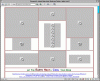
It does look fine in Dreamweaver for me as well as I've looked at the code here as well to try and fix it. BUT, if I view it in Chimera it looks like this
I'll try messing around with that some more and see how it looks.

Hope this helps.

Yes, thanks for your help. :)


Also I've had a play around with the page as well, and the nav box does seem to be the key.

This doesn't seem right to me becauses the navigation box is on all the other pages and they all look fine.

Still, I'll try some stuff with that and see if I can fix it.


Although, there seem to be a lot of tags attached to the right-hand pic (genesis.jpg). I've attached a pic, does it look right? They might be pushing something around.

It might have something to do with the multiple DIV tags. I'll look at that code some more too thanks. :)

Thanks for all the responses so far guys. If anyone else has more input, it's always appreciated.:cool:
 
Originally posted by devonferns
Can someone please take a look at
this
and tell me why the border of the table isn't tight with the images at the top?
The thing to always remember when you are using tables to allign images is that you've got to remove all line breaks.

This code...
Code:
<tr>
   <td>
      <img srr="image_1.gif">
      <img srr="image_2.gif">
   </td>
   <td>
      <img srr="image_3.gif">
      <img srr="image_4.gif">
   </td>
</tr>
ought to be the same as this...
Code:
<tr>
   <td><img srr="image_1.gif"><img srr="image_2.gif"></td>
   <td><img srr="image_3.gif"><img srr="image_4.gif"></td>
</tr>
...unfortunately that is not the case. Remove all spaces, tabs, and line breaks to confirm this is the problem, and not something else.
 
Also this code is redundant and contradictory:
Code:
<td align="[b]left[/b]" valign="top" width="231" height="258" rowspan="2"> 
   <div align="center"> 
     <div align="center">
       <font face="Times New Roman, Times, serif" size="7" color="#FFFFFF">
          <b>
             <img src="genesis.jpg" width="231" height="258" align="top" border="0">
          </b>
       </font>
     </div>
   </div>
 </td>
Why have the table cell "allign=left" if you are going to turn around and just use a "div" to center it?

Any why do you have "font" and "b" tags around images?

Clean it up to this:
Code:
<td align="[b]center[/b]" valign="top" width="231" height="258" rowspan="2">
   <img src="genesis.jpg" width="231" height="258" align="top" border="0">
</td>
(In this case the line breaks are just for legibility... see the post above.)
 
Originally posted by TommyWillB
Why have the table cell "allign=left" if you are going to turn around and just use a "div" to center it?

Any why do you have "font" and "b" tags around images?

Thanks again. Dreamweaver creates a lot of junk tags that I've removed most of, but I guess I missed those ones.
 
I concur with all the comments above... I do have one more comment though. It looks like someone "borrowed" code from another page which might explain some of the strange tags... etc. I always code new pages from the ground up to avoid anomalies like this.

Hope this helps...

Cheers
don
 
Yes, some code was "borrowed" from the index page I believe because it has the same format, so it would make sense that if the same code was used as a basis, then it would look the same in the end.

Obviously this isn't always the case though..

Thanks for all the input so far:D
 
Originally posted by TommyWillB
Remove all spaces, tabs, and line breaks to confirm this is the problem, and not something else.

That's not the problem now that I've had the chance to play with the code some more.

Any other ideas?

I think that I've gotten rid of most if not all the redundant tags now, but that hasn't fixed the problem...
 
Originally posted by MDLarson
You might want to try deleting the combined row (a little akward to describe)—it's what makes the top of the navigation bar box bump up rather than strait across like a rigid table.

I just tried that, and it doesn't fix the problem either...
 
Back
Top