How does this look???

martinatkinson

Registered
Hello!

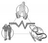
I am designing a logo for a company I have attached a draft of my logo idea, could you please let me know if you see anything that could be improved?

Thanks!

Albert

P.S. Here is the email I got from them telling me what they want:

I would like to see you design something
that conveys the three-pronged approach to helping with medical needs -
prayer, encouragement, and finances.
 

Attachments

  • tri-logo.jpg
    tri-logo.jpg
    37.7 KB · Views: 46
think simpler... complex illustrations like those will not reproduce well when on a letterhead or business card.
 
Hello!

I will think about this tommorrow and try to com up with something "simpler". Thanks for your suggestion. While we are on the topic, what do you think of the logo at http://www.myfamilycenter.org/? This is my all time favorite logo design I have come up with. Boy, I'd better go get some sleep, I am seeing 3 monitors! :)

Have a great day!

Albert
 
Your idea is good, the logo shows everything which are described in the e-mail. I think, if you want to simplified it, you can choose just one thing to be the main theme, maybe hands. I have attached a image, I hope it can help you. Something are important in logo design. Print it on different kinds of materials and size. Can it easy to see when it is printed on different materials and size. e.g. If the logo is too complex, it will be difficult to see when it is print in a small size, like on a name card.
 

Attachments

  • logo.gif
    logo.gif
    2.2 KB · Views: 27
In logo creation it is good to try several different directions, working on a number of ideas and concepts, be they purely symbolic, typographical, or a combination mark of the two.

When deciding on the level of detail you must take into account the use of the logo. Large signs, banners, even some web applications can justify a larger more detailed logo, but such logos won't reproduce at small sizes on standard buisness collateral (cards, letterheads, envelopes).
 
Back
Top