How's my site? Pro opinions

Hidden Gekko

3 Years and 100 Posts 0_o
I need a few people to give me some opinions in general about my website, it's content, it's navigation. There are still things im working on as of now, but it's pretty much complete.

It's been up for a year and uses shtml currently. Just stop by for a sec and give me any suggestions/comments, etc.

My site specializes in Digital Art, game reviews, and fiction. I hope you don't consider this an ad, but more as a way of trying to become the best possible.

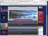
www.digitalizedzone.com

Thx for stopping by and commenting.
 
First impression: The clutter makes my eyes bleed.

My advice (though I'm not really in any position to give advice) is to lay off the effects. Just chill out with the Photoshop or whatever, ya know? Everything you do should be done intentionally, and a lot of the stuff on the site just looks like random filtering.

Also: treat any text you work with as if it were solid gold.
 
Hard to read... use more serif text and less fancy font images (too long to load, harder to read, less elegant).
 
Odd. most of the text does have serifs in my browser (Safari). And I have my default set to Helvetica.

It may have something to do with the fact that the font name Times New Roman is not wrapped in quotes in the style sheet.

Wrap everything.
 
I dislike sites that have a click-thru "Enter" page. But that's just me. They're cool to show off your graphics, but just get in the way.

Also, is it really necessary to have a "Go Back" button that takes you right back to that silly click-to-enter page? A better use for that space up top would be a banner, if you get enough traffic to your site you can make some money putting someone's banner ad up there.

As far as the overall layout is concerned, it's very boxy and square. If that's what you like I can't tell you otherwise. But it does get boring (you notice how most of those postNuke sites look the same just different colors?) and it's a throw back to the HTML days in the '90s.

Personally, I'd move the page counter to the bottom. They have no visual advantage, only provides a function. This function can work for or against you, how will people react when they see the number of visits your site gets? And for 12 months of active duty now? It also says something about you, you have interest in the popularity of your site - well who doesn't - but you put it right up there for the world to see. Do you have site logs or something that gives you that info? Other than a graphical page counter. That info should be kept to yourself.
 
I could remove the back button easily. It was something we used a while ago when we using html but it serves no purpose anymore.

text hard to read? I can read it fine - the only thing a tad hard is the image table text which can be fixed easily. I like making image maps anyway :p

I like the plain design for now. Someday i'll make cool background images, but not yet.
 
I took this screenshot in Safari 1.0 and painted some red on the text and graphic zones I had problems reading.
 
Depending on your screen settings, many of those graphics are very dark. The text is just the same, you should use more websafe colors. Also, building up your text sizes with CSS and measures such as pixels or (best) em's would be perfect. If I were you I'd also try to harmonize all graphics to create page coherence.
 
Thx for doin that.

Affiliates I can't do much about though. As for the poll image, i've been meaning to change it for awhile. The story image will probably be changed later when I actually finish it. Number of images looks fine now - I fixed the blue behind it. I'll do something later with the counter area.
 
It's not very attractive. Sorry.

Looks like you have a bevvy of content though, so a quality redesign should put you in the pink...

Good luck...
 
Too much stuff on a same page. Cut image quantity by half, avoid using those fancy fonts and use plain ones or cool unknown ones, use lighter coloring.
 
I prefer sites that are a little cleaner and less options. I wasnt really sure what the site was about for a while.

Navigation? I thought your nav graphic was a banner ad for another company. If you are familiar with the site it isnt a big deal but first impressions are crucial for maximum return. I would prefer that the navigation took up a smaller portion of the page. That is a big area and you have to scroll every page.

Do you really need a 12 line disclaimer, why not a pop up disclaimer or at least justify it with less line breaks and size 1 font

The info on the side bars is not really useful. do you need that to show up on every page?

By modifying your navigation and layout you can make the site much more effective and help visitors find what they are looking for and this will also make the actual content of your site stand out more and be the focus of the page.

With all the clutter on the sides, you rduce your options for displaying content to the way you have done it. Top to bottom, line to line. If you eliminate even one of the side bars, you can be way more creative with the content display and use some different layouts with tables or whatever.You should also use some spacing on the main content area so the text doesnt touch the side bars. Having some space there will allow the eye to focus on the content and not read right into the side bar on the next line.
 
Back
Top