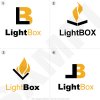
Logo Ideas (Your Vote Matters!)

Which logo idea is best?

  • Number 1

  • Number 2

  • Number 3

  • Number 4

  • Other (I'll post my ideas)


Results are only viewable after voting.

Trip

Registered
I've designed this logos real quick, and i must say they are pretty interesting for the subject at hand. Basically LightBox is a company that creates website templates and sells them online. They also do logo and game graphic design. So tell me which one you think is best. And if possible tell me why. :)
 
#4 was the first one to catch my attention. In other words, it's the best logo :)
I like the contrasts and the general bold figure of the logo. But maybe you should try to make the text fit better? Maybe using the bold font for the whole name (since the whole logo itself is bold)?
 
Forgot to mention: The text isn't actually a part of each logo, i just threw random text in there because i was bored. :) So all you really need to be looking at is the icon.
 
3... the others look like a paint/chemical company or a freight box/shipping company. The flames should probably be shaped more into a light bulb with the inner filament burning brightest... there should be a reverse of the bottom dark v to form the top of the box which should be at least 40-60% lighter... grey in color of set on top which would then finish the box concept
 
Very wise comment there moav, i'll take all that into consideration here. Oh and: it
s a "l" not a "v" on number 3, although i completely understand how it can be a "v".
 
Hmm. What about making the L in #4 more like a box, and make the yellow B a shadow of the box? I think that could give a cool effect...
 
Originally posted by Trip
Basically LightBox is a company that creates website templates and sells them online. They also do logo and game graphic design.

Servus.

Frankly, I wouldn't consider any of those four to fit the purpose. Instead of working my way through the problem to come up with something I'd rather help the brainstorming process:

What's "LightBox"? A box with little weight? A light weight? Is it a box containing light? Is it a lit box? What was that company doing - website templates. They're creating stuff for a box that emits light - the monitor. They usually work with a medium which is lit by default (broken monitors aside :)
Is "light" being used intending a pun? Does it suggest "Bright brains at work for (or in?) a box"? Or is it meant as "light" instead of "full version"? "Light box" instead of "Heavy work"? A cheap pizza cardbox?

As websites are composed of rectangles (windows) and get "alive" by the use of light, "light box" might be a bright rectangle. As the company deals with flat (2D) design only, a 3D approach doesn't "sound right" to me.

If it weren't overused, I'd suggest some bright rectangle with a dark(er) border, showing some transparency and fine lines as if it were a TV screen (yeah, say "Aqua" to me. That's the problem here). However, as geniuses know what to clone you shouldn't hesitate to try to make the typical Aqua look work for your purpose. More or less that's what the company tries to sell: A better looking human interface on well known platforms.

Well, in case you want to contact me directly feel free to do so. Being busy with a lot of my clients stuff I haven't the time to come back that often.

All the best,


Norbert
Human interfaces for all media
 
Trip

Remember that opinions are like...you know what I mean!

I do agree that the logo should more directly and quickly represent what the company's main business is. Nike has a swoosh for running fast, Shell has a shell logo...you get the idea. I think you play on the camera idea with a rectangle with a light in the circular lens. Make sure the logo is easy to reproduce in black and white as well as in color and that it's not too expensive to print. Your client will love you for considering all these things.

I assume Light Box is for an image company?

Cheers
 
So are these a good example of showing what the company is all about? I see what you're saying and i think when i get home later this afternoon i will work with some more ideas. Thanks much!
 
Originally posted by Trip
So are these a good example of showing what the company is all about?

Servus, again.

Well, despite my promise I'm able to follow this thread by means of that e-mail notification - a great feature of this site, thanks to whoever built it.

OK, now to your question above. First of all, natobasso also confused "logo" with "sign". The word "logo" comes from "logotype" and it means a uniquely designed/typesetted company name. What's a "good" logo? Something you haven't to change all too often and which reflects the companies style. A great logo is "IBM" - the company's name in bold egyptienne style letters formed by blue stripes is a perfect example of a good logo. The same goes for Microsoft, with that packman like "o". Their previous logo was much simpler, with a striped "o" in "Micro" it looked like an IBM subsidiary (was this intended, given IBM "made" Microsoft?).

Apple in turn has put its name in compressed Garamond - a simple solution which is "widened" by using the same font for headlines, even in the web, where serif fonts aren't a first choice. So they had to use big font sizes and this makes it a good example of "logo placement".

In this sense, I think #3 is a good example of a well designed logo. I'd try to enhance it by using capitals for "light" and the font size for that word to match the "optical weight" of the bold "Box". However, this is a logo, but the discussion should focus on the "sign".

Now Apple also has a "sign", that Apple you can see on the upper left of your screen. That's a sign, not a logo.

I too referred to the sign as a logo, to prevent me from writing the stuff above :)

OK, what's a good "sign"?

Shortly put: Something which is unique, doesn't make use of any letter (!) and helps to build an immediate recognition. Putting a shell on every gas station is at least smart - it's easy to recognize and as that logo has a long history, we all learned what to expect from a lit shell in the public. Signs are always directly related to the context, to what people already know. A good sign should visualize the name of the company or its primary business. The sign became popular in Europe at about 1200 a.c., when people couldn't read and companies had to advertise their names in front of the shop - inns named "eagle", "swan", etc., or professions, like shoemaker, butcher, whatever. There's a great book about this, Adrian Frutiger, "Man and his signs" (or the like, I simply translated its German title), so if you're interested, have a look at Amazon.com :)
In general we face a trand to more abstract logos in our days. Nike's "check mark" and Adidas' "Three stripes" became well known signs because of the size and public display of the companies. The sign itself won't work if the company hadn't put a lot of money in building the right context. Seen this way, those signs aren't the best examples when de-sign-ing for a small startup.

However, the companies success isn't tied to its sign, so no matter what you use, it can be changed once demoscopic research demands it (like Microsoft did). Funny enough, the most successful old companies kept their logos for a long time, with minor changes to reflect the change in time, but the (abstract) star of DaimlerChrysler, the (simple) sign of Volkswagen and of course the shell and the bitten apple remained, while "better" signs disappeared.

Which raises an important question: Where will the sign be used?
I have trouble to imagine shopping bags and screen banners showing any of those four signs for "LightBox". The company will have little public display, as it doesn't produce mass-marketable goods (heck, who knows if tomorrows consumers wouldn't get into their grocery store, asking for some fresh website layouts?).

For this reason I would concentrate on the logo and on a proper corporate design (including proper typefaces, high quality paper for letters, etc.) instead of wasting a lot of time crafting "the sign". Of course, if you intend to put that sign on every website layout you sold, it should be as simple as a bitten apple to fit nicely on every screen.

There's a simple test for a sign's quality: I show my layout to my (now three year old) son and if he points me to that sign everytime when he finds it in ads or on products, I know I was successful. If needed I'd show some of my working designs, but I think the message got across - don't feel obligated to anybodies understanding, but stick to the uneducated minds, as signs aren't ment for people who perfectly understand everything - for those you have to find the proper typesetting to keep them reading your message. And the latter also require a well designed logotype and as those are the ones who will be the majority of your products, you can easily omit the sign...

My 2%,


Norbert
 
i like things simple.. so i actually like the text of logo number 3 best as a logo lol

anyways i dont have much to add, these guys are giving good advice :)
 
So sign wise...could you give me any good ideas for a sign or are these prime examples that i have posted?
 
#3 - lettering aside, it is the most eye catching graphic. it's simple, but not too simple. the letters are just too plain. they look more like a trucking company or something. if i have any suggestion, it would be to ask what that flame would look like inside a box, not a check?

|__| with the flames inside?
 
when you make a logo, you usually want to make a logo set

a logo only, a logo w/ text (vertical like you have. a logo w/ text (horizontal), and a b&w version at the very least...

you need to think of all possible uses for this logo and develop the whole thing with those uses in mind...
 
Servus, Trip.

Sorry for confusing you, but my first mail referred to what I thought would work as a sign. I just stuck with the term "logo"...
Or did I get you wrong again and you're asking for some idea from my board? Well, will try to sketch something, but having to take care of both my kids and the household it might take a while to get it to you...

Norbert
 
No worries dear Norbert.

BB: If i have time today i'm going to re-do some logos and make some new ones. I'll take into mind what you've said. :)
 
I think number 3 is best, but you have try what Ed said, I think he's onto something... :)

I was wondering, I think it's kind of interesting...how did you establish yourself as a graphic designer so young? i.e. do you just wait for people to find your site and email you for help? It sounds like fun to have a job like that. :)
 
Back
Top