Rhapsody mockup shot, circa 1997

endian

Dis Member
Here's a 'concept' screenshot for what was then Rhapsody that I found back in '97. (The date on the file is September 4th, 1997, 12:31AM) It obviously has a lot of NeXT-isms, but things like the translucency and revised menubar layout more or less happened in OSX.

I've been haunted by this screenshot for months, searching all my old disks. I finally found it on a DVD that was a backup of the external HD that was a backup of the internal HD of the Centris 650 I was using at the time. :D
 

Attachments

  • mockup_finalgamma.jpg
    mockup_finalgamma.jpg
    87.9 KB · Views: 1,631
I think we should be glad that Apple didn't use that! LOOK AT THE SIZE OF THE MENU BAR!:eek:Puke!

And some people complain about things in OS X being too big!

Let us now have a moment of silence thanking apple for Aqua... :p
 
I can honestly say that THAT is an OS I'd use. The Menu Bar may be HUGE, but look at how it uses icons for each menu instead of names. (I wanna see what the menus look like opened. Are they transparent? Yes I see the File menu is ripped off, but what do they look like still attached?) The thing is that each App writer would have to create an icon instead of names, but is that so bad?

I like the giant clock (With the date Next to the clock.. A feature I want to see in OS X.. OS 9 as well...) and Apple logo, The picture for each user (Which XP now has.. UGH)

The Color Scheme I don't like, but over all it's nice.

The Menus are also detachable.. That's a nice feature.

Are there more shots like this? Was this a working model? I want to have this OS now! Nice addition to my collection.
 
This is a VERY telling screenshot!

The Dock in this image is obviously broken out into tabbed sections!

I would LOVE to see tear-off menus finally make it over to OS X. I loved them in NeXTSTEP.

The flat, bright color scheme screams M$ Luna. In keeping with M$'s history of stealing the entire interface for Windows 95 from NeXTSTEP, it almost appears as if they stole Luna from NeXT again. Except this time, Apple was more than a step ahead.

I love the way the basic menu items are simple icons, as well. Especially with the icon being repeated in the 'title-bar' of the tear-off menu. I allso like the two little sub-menu items: Add Menu Item (customizable menus?! and Services). Has anyone noticed that their Services menu in OS X just keeps getting bigger and bigger? I mean I love the Services, but I hope it doesn't turn into one of those HUGE scrolling menu's (like the Apple Font menu).

I think that we are seeing the early days of OS X that has been totally modernized by Apple. I expect to see more of these ideas popping up in OS X.

Even the little clock icon (although two color in this image) has made it to OS 10.1 in the menu bar!

Truly fascinating! Are we certain it's real?
 
Check out the column view! It seems that 10.0 took a step backwards... and 10.1 is only just getting with the program.

And I think a lot of people would like that dock better than OS X's.

I'd like the icons in the menu if you could make them smaller, and if you could customize them.

The trash is named recycler... ick.

It's got some nice features (that will hopefully show up in X soon...) but I'm still glad Apple didn't keep it.
 
I should clarify here - AFAIK the screenshot has nothing to do with Apple. It was posted by a user to a mailing list (Apple-HI developers? I'm not sure.) It's not a working interface, just a graphic someone put together in Photoshop to illustrate their ideas.

OPENSTEP 4.0 was supposed to have a tabbed dock similar to that one. Here's a shot of it http://www.occam.com/leonvs/computer/os4m.html

The Trash on NeXT was always called Recycler. I think Apple had a patent on the word Trash or something.. LOL

Here's a page with a general overview of the NeXT GUI:
http://www120.pair.com/mccarthy/nextstep/intro.htmld/
 
The tabbed dock was part of the developer release of NEXTSTEP 4.0 (before the name change). It was my understanding that the interface was dropped because the interface on OpenStep Solaris was going to still be like the one used in NEXTSTEP 3.3, so the final release of OPENSTEP 4.0 was something of a let down. the tear-off menus existed from Rhapsody DR1 to the final version of the original Mac OS X Server (1.2v3). Actually I have found that tear-off menu eat up the same amount of screen space (usually the entire left side of the desktop as wide as the menu) as the original NeXT menus did. I found that 20 pixels running the length of the desktop is less intrusive than 93 running the height of the desktop (assuming that you didn't want part of your document or app lost under the menu, and that is not counting the other 68 running the height of the desktop used for the dock).

Anyway, here is my collection of docks from the past (at least the versions for NeXT and Apple that I've seen).
 

Attachments

  • dock-history.jpg
    dock-history.jpg
    61.8 KB · Views: 390
I would still like to see Tear-Off menu's in OS X. Instead of the vertical NeXT style menu list, they could simply tear off the existing OS X horizontal menu bar.

I used to arrange submenu's with frequently accessed features around my documents in each application to speed my workflow. Not all features have key-combos, and even some that do aren't the easiest to access nor remember.

In a way, I feel that some of the problems that OS X has stems from reconciling its desktop based metaphor with the FileViewer metaphor of NeXTSTEP. Personally, i lean toward the FileViewer side of the fence, and would like to see the Object/Document centric NeXTSTEP metaphore (rather than the application centric metaphore of MacOS) win out.

 
I much prefer the DP3 dock to what we have now.. Although, through the early development process I was gunning for a dock more or less true to the NeXT dock. That thing is soooo functional.
 
I also think the DP3 dock is cool. Plus the square backgrounds make it appear that there is a larger area to click on. Fitt's law at work....
 
Fitt's Law is a set of multiple rules that creat a good GUI. These are the rules that you always hear the MS and Apple are ingnoring. They state things like, the larger the target and the closer the cursor, the quicker that aqusititon. Thats why you can supposedly move about the filesystem quicker if you custom icons that are huge.

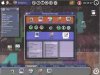
This is why the Apple menu bar is great. If you think about it, the buttons are of infinite size, since you can throw the cusor as hard as you want to the top, but you always get to the menu bar.

They did a test on Apple users, and they figured out that if there was another screen over the menu bar, apple users would throw their cusor so hard at the menu bar it would almosty reasch the top of the next screen!

This menu bar's efficiency is the main reason the whole mac OS is more efficient that MS's overall. The MS menubar is a disaster of ergonomics, since it cannot be attached to the top by copyright law, it needs to be on the menu bar, making it an infinitely smaller target. Get it?

Same with the windows tast bar, you have to aquire the small button, you cannot go to the direct bottom, you must first move towards the taskbar, and then slow down to aquire the button you want, if you go all the way to the bootm of the screen, it wont do anything if you click.

There are portions of the screen that are more accessable to some users than others. For right hand users, they go like this:
1. Upper Right Corner
2. Lower Right Corner
3. Upper Left Corner
4. Upper Left Corner

Replace the right with left for left-handers

This strikes a blow to MS Win. Is bill left handed? cuz he built an OS that thinks everyone else is.

That start button is in the hardest place to get on the screen for a right-hander, the bottom left corner, and how many times a day does the average user do that? And again, this button is hard to aquire since it doesn't lie on the exact edge of the screen. Quite often i would suppose.

The icons are on the left side, further hurting it's accessability to right-handers.

Wondows is ergonomicaly correct in some respects, right click can be very functional. What could be easier that getting to where you already are?

whew! i think theres bunches more, but this is what i know off the top of my head
 
I'd just like to point out quickly (it's a little off topic) that the icons of the OS X dock can have just as large an area for clicking as those in the NeXT dock--if not larger.

Per the Apple Aqua HIG, it is up to the application developers to define the clickable-area mask of the Dock icon. They have the choice to closely follow the icon image, or they can 'give' a little.

The difficulty of hitting items in the OS X dock is not necessarily the fault of Apple, but rather the appliction developers.
 
Fitt's law is another reason why the dock is better off at the bottom of the screen, regardless of the ability to move it (which I do support.)

Try it: start from wherever your mouse is now, and flick the it to the bottom of the screen, then 'scrub' across as if over a row of icons. Then move the mouse back toward the middle of the screen and repeat those steps, only using the right edge of the screen. Much harder, and on a large screen you may even have to 'row' the mouse to get all the way there. And it's alot harder to make precision movements as for selecting an icon vertically than horizontally.
 
It's just sad to see that Apple seems to be throwing all the GUI Guideline Rules they created in the beginning for OS X.

By which I mean some of the following..
1) The Close, Minimize and Zoom buttons are all on the same side. The Close button was originally separated to prevent accidental premature window closure. They try to make up for the boo boo by Color coding the buttons. (I'd much rather have the buttons where they used to be.)

2) Having the Trash in the Dock (Which I like BTW) defeats another rul, though not right away. See, as long as the Dock is on the bottom or right, the trash will always be at the bottom right corner, but if you dock it on the left (Or top) the rule is shattered to pieces. (I like having the Trash in the Dock as it is always accessible now, some people like it on the desktop. To each his own)

To me, OS X will never be perfect until the functionality equals or surpasses previous Mac OSes. Right now, it is no where near finished. And X.1 won't be either. It will take a lot of Feedbacking to Apple to get it "fixed". I also have a list of things I will not be happy until they're incorporated. But I won't go into that right here, right now.

Check www.MacKido.com for more info on the GUI Guidelines (It was last updated when OS X was still a developer preview and shows goods and bads of Mac OS 9 and Windows as well as NeXT and BeOS... Gee, guess whose GUI is the best? ;) )
 
In practice, these objections don't hold up (at least not in my experience.)

I've been using OSX all day every day since 2-3 days after the beta came out, and I've hit the wrong window control exactly once (yes, I've been counting). And that was when I went to hit the zoom button and hit the minimize button instead. The close button wasn't even involved. I've certainly spent far less time this way than I used to spend under 9 dragging windows leftward so I could get at the controls which were off the right edge of the screen. I still have to do it in order to scroll in apps with no scroll wheel support, but that's another story.

As far as the trash, there are pinning options that may just not have been enabled yet due to Carbon apps being dock-ignorant. And I can't remember the last time I dragged something to the trash anyway; right-click > Move to Trash is a lot easier.
 
Back
Top