You are using an out of date browser. It may not display this or other websites correctly.
You should upgrade or use an alternative browser.
You should upgrade or use an alternative browser.
this is boring help me fix it
- Thread starter nb3004
- Start date
cockneygeezer
Registered
nb3004 said:what would you do to improve this image, i like it but it needs something so it pops
How this? (Check attachement)
I feel that the typography for this picture is wrong. You need to increase the kerning of the lettering so that the words don't look big and chunky.
Hope it helps?
Attachments

")
nb3004
Postmaster General
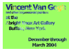
http://www.ibiblio.org/wm/paint/auth/gogh/self/gogh.self-orsay.jpg
http://www.ibiblio.org/wm/paint/auth/gogh/starry-night/gogh.starry-night.jpg
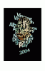
the first one is the self portrait and the second one is starry night a famous pict. The problem is that this is an assignment on photos masked by type and i wanted to do something to challenge myself a little, i am very interested to see what others come up with though
http://www.ibiblio.org/wm/paint/auth/gogh/starry-night/gogh.starry-night.jpg
the first one is the self portrait and the second one is starry night a famous pict. The problem is that this is an assignment on photos masked by type and i wanted to do something to challenge myself a little, i am very interested to see what others come up with though
Trip
Registered
Just some quick ideas (yea, I know) to help with the thinking process. Any questions just ask...
http://www.tannersite.com/BackupFiles/3dvan.jpg
*bleh, 7 layers!
http://www.tannersite.com/BackupFiles/3dvan.jpg
*bleh, 7 layers!
ksv
web developer
Find some other painting with, ehm, more attractive and matching colors. Perhaps you could use a filter on them. Van Gogh paintings obviously don't look good with masked type 
Use an other font. Two would probably look better, or use plain/bold text for info/headings. Add a simple drop shadow to show the contrast better.
Use an other font. Two would probably look better, or use plain/bold text for info/headings. Add a simple drop shadow to show the contrast better.
BitWit
Flash/JavaScript nerd
The problem is the value contrast between the light green and some of the similar shades of white, light blue, and gray in the painting. For instance, if you changed it all to grayscale, some of the letters would hardly show up.
If you darken the green, you'll just be shifting the problem to other parts, and lightening will do the same.
To get more readablility, I recommend making the letters cast a "knockout" shadow onto the painting. The result is that it looks like you have a green surface with the letters cut out of it revealing the painting jsut behind it.
In Photoshop, knockout drop shadow is a layer effect, I believe.
Arden
Where mah "any" keys at?
Oh, please. I use shadows all the time to give stuff the look of being "on top" of something else.Jason said:no shadows
shadows are a thing of the past, we are now past that "gee whiz" effect
You could also give the text (big, thick letters, of course) a drop shadow that completely surrounds each letter at least a little bit and lower the fill opacity of the layer to 0 to make it look as if the shadow is the only thing there.
Or type out your text, white, black, or whatever, and give it a layer mask of those very same letters that hides them. Then unlink the mask to the layer and offset one slightly, hiding most of the letters but leaving a thin outline.
What is the target destination for this project, print or online? That can make a big difference in what looks good or bad.
nb3004
Postmaster General
lol, honestly this was just a small assignment on masking images by type and i never really was happy with how it looked. This is what i finally ended up with before moving on to do other projects. Thank you so much for all the attention you guys have put toward this. BTW im still not happy with it hahaha
") , but if it gets you the grade that's what really matters.
, but if it gets you the grade that's what really matters.