this site could look better

Last I checked I had nothing better to do but sit around and come up with 20 some themes for you all to use.

I think McDonalds should have optional "themes" for their cups, I think we should be able to choose which cup design we get with a matching bag, tray, straw and of course, color matching fries.

ME
 
Hmm... I don't think the site needs 100 designers and twenty moderators plus admins and site owners to discuss a future theme to the pixel. :)

Yet I answer. Strange. :)

Okay, here's my suggestion, and this is difficult for me as a designer (I mean, not to design something but rather just suggest in words):

I think the brownish, rusty theme is just too far away from Mac OS X. I'm not a fan of "Make it AQUA!", but I think a theme for macosx.com should definitely make use of white and blue, OR fit Safari, as I think soon enough Macs will come with Safari as the bundled standard browser.

A lightweight white and light blue theme can be seen on my comments' forum for macnews.net.tc: http://icity.net.tc ...
 
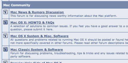
Just did something interesting. I happen to like the shapes macosx.com is using (that's the default vBulletin buttons and stuff, right?), I just think the colour scheme should be different... I copied some and played with the saturation/colour... This is what I got:

*try again fryke with different forums :D * (ed)

And I think it wouldn't be too bad for macosx.com to go in the direction of gray/blue...
 
Would these 3 look too aqua or girly -as colors- ? Nothing seemed to work after changing icons in a woltlab bb.
 

Attachments

  • fdaed-colorsamples.jpg
    fdaed-colorsamples.jpg
    88.3 KB · Views: 17
I liked the deep blue theme. Too bad it didn't stay for too long.
However, this theme is great for now. :) Much better than I could ever do, since I can't ever see the big picture clearly.
Why not go green? :D :p
 
Originally posted by fryke
Just did something interesting. I happen to like the shapes macosx.com is using (that's the default vBulletin buttons and stuff, right?), I just think the colour scheme should be different... I copied some and played with the saturation/colour... This is what I got:

fryke's image

And I think it wouldn't be too bad for macosx.com to go in the direction of gray/blue...

Along with the currect scheme and the one before this one, this scheme I could get used to, too. I like it.:)
 
well, personally this is my favorite theme of any i've ever run across!! and i don't see how you could make it any more like jaguar and still be readable. this site is jag colored as is.

the blue is ok, but seems like a step backwards. the flourescent orange hurt my eyes. bright colors might appeal to some people but they really aren't very healthy. all i need is one more cause for a headache. :rolleyes:

this theme has only been up for 3 mos. how about we keep it for a while longer?
 
fryke, that duotone version was real cool. I don't want this to turn into a graphics bashing thread, I love this site, but I do agree with the fact that the color scheme here is not representative of osx or Apple style and could really look cool if some time was spent on it.

We graphic design people come from a different half of the brain, we are heavily visual. We are used to seeing STUNNING VISUALS like http://www.showlogic.com/ and http://www.2advanced.com/ and http://www.highersourcemusic.com/index2_withintro.htm and http://www.droppod.com/ and http://www.vulcan.com/index.asp and finally http://www.westonfl.org/

so this site, compared to those, doesn't compare. No offense to the AWESOME content and people here. =)
 
Okay. :)

GREEN BLUE NEGA

The attachment is a simulation of what I suggested before. More themes = you decide how you want to feel and see the site. How about creating 4 - 5 styles - only difference the brown header being in different than brown .. Sorry for the rainbow style but .. 1 pic, just a lot of alternatives.

[Edit: the attachment cleaned here. ]
 
Thanks, Ed. ;)

lowsaturation.gif


A bit too bright this time, but it's late night here, so... :)

The idea is to use gray and blueish colours in the colour scheme in order to kinda fade into the background. Would promote the ads better (*grin*) and of course the content and avatars...
 
maybe scott didn't make himself clear - he's not really interested in doing all the work involved in maintaining a variety of styles to choose from for a site that he pays the bills on and we use for free.

as for visually stunning sites, they're great for visual stimulation. they're overwhelming for forums. we are not an art site. we're a tech help site at heart. everything else is just extras.
 
maybe we could make this a yearly thing where we change the colors? (ed and scott are right i mean we have only had this theme for 3 months)
 
I understand the rediculous ammounts of time maintaing a site can consume, Especially anything on a graphic level. The only way it could happen is if some talented graphic person with plenty of free time(definately not me) was able to put in the time to assist Scott or whoever.

The payoff would be worth it though. Personally (and I don't believe I'm alone), I would be more enticed to come back to this site if there were more graphic customiztions to explore.

I know full well all this graphics hub-bub is cheesy and unneccesary for the content and programming purists, but I like cheese. Especially Muenster.
 
Back
Top