You are using an out of date browser. It may not display this or other websites correctly.
You should upgrade or use an alternative browser.
You should upgrade or use an alternative browser.
Thoughts on a new site of mine?
- Thread starter Ricky
- Start date
")
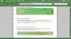
I agree on the nav bar, just feels weird and is a problem for accessibility. A screenshot from Lynx is attached so you can see what I mean.
You might want to change the doc-type to a HTML 4 variant. XHTML shouldn't have tables used as a layout method, just for raw data.
There's some errors that are preventing the validation of the site, which could cause problems in some browsers. Check out the link below to see what they are.
http://validator.w3.org/check?uri=http://www.curmudgeons.com/
I've always been a fan of simple, clean, & elegant for sites. The idea of a website is to convey information after all. I like where you're going with this, but there's something missing. I can't put my finger on it, just feel like there's something not there that should be.
Attachments
Ricky
Registered
Can't read sideways?Arden said:1) Sideways links = neck strain.
")
andychrist
devil's plaything

octane
I have issues, OK!
Whichever way you choose to have the navigation tabs, I'd have the chosen tab / page highlighted in someway so the user knows where they are.
Move the legal stuff from the bottom left to the bottom right, it's too close to the navigation menu.
The colorized titles are nice, but they're pushing the content down into the page and it's getting close to the 'fold' of the screen.
Stick a couple of points onto your line height. Ideally, 14pt, it makes for more readable type. if you have deep paragraphs, people are far less inclined to read it.
Don't put your email addresses into your pages. This is inviting trouble. If your email is so easy to access, the spammers will find it.
I sincerely hope you're going to have secure socket layer on the payment page?
Just a few thoughts, take it or leave it .. it's up to you...