How many years has it been that we've had the same buttons and the same bars in the same places with the same design problems?
Admittedly, a complete overhaul is fairly out of the question. It would alienate most of Apple's customer base. Everyone would have to relearn the OS and most would be more than slightly irritated.
However, Apple has always been focused on design (sometimes in spite of usability) and recently has made improvements that suggest it's finally coming around to changing age old standards.
e.g.
Quicktime no longer shows a bar or controls unless you hover.
iTunes Cover-Art-Player (name?) does the same.
Lion has a somewhat redesigned Exposé.
Attempts have been made at redesigning the mouse (Magic Mouse / Trackpad).
On the other hand, other items stay irritatingly outdated.
I have only a couple of points to make.
Firstly, there is a fair bit of wasted space in "bars."
The menu bar consists of items on the left and items on the right, yet spans the entire width. This could easily be removed and the space used widened as needed.
The top bar on most windows is completely useless. It's not quite as bad in some apps, such as iTunes, but most apps take up a large amount of space simply to display the name of the app. Granted, this space is typically used to drag the app around, but I argue that such functionality could be limited to a single space rather than an entire bar. The title doesn't need to be present at all as it already exists in the menu bar. If could, of course, simply be displayed aligned left and leave the rest off. Some applications, Safari for example, could use this method.
In many applications there is still a useless bottom bar used to "frame" the window visually. We all know it's a window, you can stop. Usually doodads are added to make the bar more functional, but the bar can serve better by being removed entirely and any present features moved elsewhere.
There is also much wasted space in left bars, such as in Finder. I enjoy the functionality of having shortcuts there, but much of the space at the bottom is wasted.
Secondly, the idea of using "windows" at all is extremely outdated. I would say Apple is fully aware of this judging by their development of the iPad (which is both awesome and lame all at once, but this isn't a discussion of iPads). The next step is, I believe, quite obvious--the evolution of the desktop itself.
I would say the main reason this hasn't happened yet is the general reaction from the end users (havoc, mayhem, etc). If I had to guess, and if I'm assuming that the people in charge at Apple know what they're doing, I would say the release of the iPad was to acclimate the end user to a new paradigm (obviously while pulling a large profit.) I've seen an Apple patent around that suggests they might be thinking this, combining the desktop with the touch screen features of the iPad. Whether the case or not, people will more than likely balk at any radical change, so my suggestion is to continue to acclimate the end user to a new model.
One idea I've been mulling over is the disorganization of windows and windows and yet more windows. Some steps have been taken to reduce this (Tabs, Exposé), but they focus on the problem rather than the solution. I propose moving the functionality of Exposé into the normal operation of the OS (possibly as just an option).
First, a button/shortcut might be added that spread and/or sorted windows much like Exposé, but on the desktop itself. It might also be an option whether to resize windows or simply sort as best as it can without.
Second, a feature might be turned on from the start to auto-sort windows as they open. If you want to leave a window open in the background, a button might be added to do so. Or, on the other hand, it could simply be minimized. After all, if the windows is in the background unseen, there is little need for it to actually be open.
Lastly, and in conclusion, we all seem to be fixated on leaving buttons in the same places and in the same configurations simply from habit. Drastic changes would, understandably, confuse more than help most users, but transitional changes are long overdue.
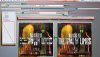
Poor sketch attached.
Admittedly, a complete overhaul is fairly out of the question. It would alienate most of Apple's customer base. Everyone would have to relearn the OS and most would be more than slightly irritated.
However, Apple has always been focused on design (sometimes in spite of usability) and recently has made improvements that suggest it's finally coming around to changing age old standards.
e.g.
Quicktime no longer shows a bar or controls unless you hover.
iTunes Cover-Art-Player (name?) does the same.
Lion has a somewhat redesigned Exposé.
Attempts have been made at redesigning the mouse (Magic Mouse / Trackpad).
On the other hand, other items stay irritatingly outdated.
I have only a couple of points to make.
Firstly, there is a fair bit of wasted space in "bars."
The menu bar consists of items on the left and items on the right, yet spans the entire width. This could easily be removed and the space used widened as needed.
The top bar on most windows is completely useless. It's not quite as bad in some apps, such as iTunes, but most apps take up a large amount of space simply to display the name of the app. Granted, this space is typically used to drag the app around, but I argue that such functionality could be limited to a single space rather than an entire bar. The title doesn't need to be present at all as it already exists in the menu bar. If could, of course, simply be displayed aligned left and leave the rest off. Some applications, Safari for example, could use this method.
In many applications there is still a useless bottom bar used to "frame" the window visually. We all know it's a window, you can stop. Usually doodads are added to make the bar more functional, but the bar can serve better by being removed entirely and any present features moved elsewhere.
There is also much wasted space in left bars, such as in Finder. I enjoy the functionality of having shortcuts there, but much of the space at the bottom is wasted.
Secondly, the idea of using "windows" at all is extremely outdated. I would say Apple is fully aware of this judging by their development of the iPad (which is both awesome and lame all at once, but this isn't a discussion of iPads). The next step is, I believe, quite obvious--the evolution of the desktop itself.
I would say the main reason this hasn't happened yet is the general reaction from the end users (havoc, mayhem, etc). If I had to guess, and if I'm assuming that the people in charge at Apple know what they're doing, I would say the release of the iPad was to acclimate the end user to a new paradigm (obviously while pulling a large profit.) I've seen an Apple patent around that suggests they might be thinking this, combining the desktop with the touch screen features of the iPad. Whether the case or not, people will more than likely balk at any radical change, so my suggestion is to continue to acclimate the end user to a new model.
One idea I've been mulling over is the disorganization of windows and windows and yet more windows. Some steps have been taken to reduce this (Tabs, Exposé), but they focus on the problem rather than the solution. I propose moving the functionality of Exposé into the normal operation of the OS (possibly as just an option).
First, a button/shortcut might be added that spread and/or sorted windows much like Exposé, but on the desktop itself. It might also be an option whether to resize windows or simply sort as best as it can without.
Second, a feature might be turned on from the start to auto-sort windows as they open. If you want to leave a window open in the background, a button might be added to do so. Or, on the other hand, it could simply be minimized. After all, if the windows is in the background unseen, there is little need for it to actually be open.
Lastly, and in conclusion, we all seem to be fixated on leaving buttons in the same places and in the same configurations simply from habit. Drastic changes would, understandably, confuse more than help most users, but transitional changes are long overdue.
Poor sketch attached.
")
")
