You are using an out of date browser. It may not display this or other websites correctly.
You should upgrade or use an alternative browser.
You should upgrade or use an alternative browser.
Photoshop 6.5 in OSX...PIC inside before Adobe gets angry
- Thread starter ThE OutsiDer
- Start date
verlorenengel
Geek Stink Breath
")

Jayem
The All Seeing
Originally posted by uoba
got a blazin G4 733 and only 256mb, comeon man, RAm is cheap cheap cheap at the moment!")
I predict that this thread is going to be very well used indeed in the next couple of hours!
I have better things to pay for than RAM... bills my friend...
 when i get the chance I'm upgrading to 1.5 Gigs
dricci
Registered
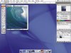
Back on topic, that Screen Shot looks like it's only running on 10.0.4 (notice the different blue in the Apple menu). MacRumors.com has an article that says it's optimized for quartz and 10.1, so that makes me wonder about the integrity of the screen cap, eather that or the integrity of the article.
ThE OutsiDer
Registered
I'm wondering why it's 6.5, when shouldn't it be 7?
Apple needs to create a "serious" theme other than aqua so the drop shadows on windows don't mess with the photo colour coodination for us designers.
Aqua is a great thing, but for professionals I think we need it to be toned down in some cases.
Photoshop dock conflicts for realestate with osx dock too.
uoba
Re: member
The thought did enter my mind about the integrity of the image.
I think it would have to be 6.5 instead Photoshop 7, unless they are putting a load of new features which will have to benefit Windoze machines as well ('cause they won't be gettin an aqua version in number 7!!)
I am concerned about the Aqua interface in general with Adobe apps (I love Adobes UI generally). Everything is bigger! Which isn't great with 10 zillion palettes open in Photoshop.
Anyway, what is AA!? (no Alcohol references please (or bad motor insurance adverts if your in the UK!))
ThE OutsiDer
Registered
AA means Anti Aliasing...Smoothing out pictures when scaling.
I never liked what Adobe did with the brushes palette, I like my brushes palette to be out floating, not spring loaded.
Also font usage and text manipulation doesn't feel easier in 6, I still prefer 5.5. Adobe Should give us mac ppl features that utilize osx's power, stuff the windows ppl, they pirate half their stuff anyway, no graphic artist is serious if they use a pc.
I say give us features that windows could never hope to achieve, why should us OSX mac ppl be held back cause windows sux?!
serpicolugnut
OS X Supreme Being
Also font usage and text manipulation doesn't feel easier in 6, I still prefer 5.5.
Are you high? Photoshop 6 was worth the upgrade price alone just for it's new text manipulation features. This is the way Photoshop should have handled text from day one. That damn text dialog box would drive me insane!
The screen shot is from OS X.1. You can tell by the Apple in the upper left hand corner. In 10-10.0.4, the Apple logo was not quite as embossed as it is in 10.1 (and as it is in the picture).
Glad to see that Adobe is adopting the "roll over" palettes for PS 6.5 that are now in AI 10. Hopefully this will be adopted throughout the product line.
All in all, it looks great. The only question is WHEN WHEN WHEN!
uoba
Re: member
Mainly because most of adobes (and Macromedia's) sales are around 85% PC! (Dont' quote me on that)
AA = Anti-aliasing... DOH!! I feel stoopid!
funnily, I thought the big deal with 6 was the brand new font features, which I remember being a god-send when it was released (and maintained people using photoshop for serious web design.)
As for the half of pc users pirating their software... I wouldn't like to guess the figure for Mac users as well!
serpicolugnut
OS X Supreme Being
for some Adobe apps (Acrobat), that 85% PC figure is right, but for apps like Photoshop, Illustrator, GoLive, After Effects and Premiere, it's between 50-50 (GoLive, Premiere), and 60 PC - 40 Mac for the rest.
The coolest thing I've heard today is that Newtek's Lightwave 7 package is selling better on the Mac side than the PC side.
The coolest thing I've heard today is that Newtek's Lightwave 7 package is selling better on the Mac side than the PC side.
dlookus
Disgruntled user
This looks pretty fake.
couple reasons:
1.The bottom of the image window is strange. The aqua pulldown button seems out of place.
2.The close button has the dot indicating that the file needs to be saved, but photoshop greys out the little image icon in the header when the file hasn't been saved.
couple reasons:
1.The bottom of the image window is strange. The aqua pulldown button seems out of place.
2.The close button has the dot indicating that the file needs to be saved, but photoshop greys out the little image icon in the header when the file hasn't been saved.
ElDiabloConCaca
U.S.D.A. Prime
Looks fake to me... although it's a convincing fake, in my opinion.
Look at the "Aqua GUI." Look at the lines in the menubar compared with the lines in the tops of the windows -- they don't look the same. Different spacing.
Also, menu titles in the menubar are always equally spaced. There are SLIGHT variations in the spacing between the menu items in that photo.
Unless someone ran a hack and changed the system font, I don't know WHAT'S going on with the fonts in the menubar, either. Mine don't look like that. I've never seen menubar items display text that big.
Just an opinion.
Jayem
The All Seeing
has any serious photoshop user ( such as myself ) given thought to the fact that the color scheme of Aqua is going to drastically compromise your work? All those widgets and pin stripes.... they give me a head-ache just thinking about it.
once again uoba please be my personal dictionary...
) given thought to the fact that the color scheme of Aqua is going to drastically compromise your work? All those widgets and pin stripes.... they give me a head-ache just thinking about it.once again uoba please be my personal dictionary...
uoba
Re: member
I've ran it through and can confirm everything is a-okay!
(I haven't really, so if anyone else wants to check?)
True about the Aqua interface. I use Illustrator 10 (which IS fantastic) but the brighter colour of the Aqua interace (lighter grey-silver rather than the OS9 mid grey) does get to you occasionally. And as I mentioned earlier, everthing seems chunkier (or clunkier!?!)
But this aside, I love it (it's only a minor irritation).