Thought you guys might like a sneak peek...

simX

Unofficial Mac Genius
I think I posted about it before, but I'm making an app called "Memory Usage Getter" that will hopefully become the successor to the memory usage display in the "About this Macintosh..." of the Classic Mac OS days.

You can get a preliminary AppleScript from www.versiontracker.com that does just this, but not graphically -- just displays the names of the apps and the memory they use in order of the top users. It's called "Memory Usage Getter" and is only available for Mac OS X (because it does UNIX calls). This is basically the underlying script for version 2.0 of this app.

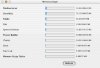
In version 2.0 (I've already submitted a beta to two testers), so far, the memory usage is displayed graphically both in a progress bar and the actual memory usage off to the side. I'm still refining it, but I thought you guys would like to know the progress.

This is made entirely in AppleScript Studio, so guess how big the app itself is? It's less than half a megabyte. :) I owe it all to the power of AppleScript and Cocoa. Rock on, Apple!

Enough typing -- here's a pic. Start salivating! :)
 

Attachments

  • memory usage getterscreensnapz001.jpg
    memory usage getterscreensnapz001.jpg
    27.3 KB · Views: 177
Hello!

Sweet! Looking good, I would be willing to use the software when it came out. How much will you sell it for?

A few suggestions from looking at your snapshot.

1.) Make the window one height and then add a scrolling pane that will list all the open applications so a user can scroll through it. This would be helpfull if the user has 15 applications open (yes I have done it) so the window does not fill their screen. You could even do something where the scrollbox is not even visible unless there is more then 5 or so applications open.
2.) I do not know if this would be possible with your language but I would make the status bars and text update automatically. Or, you could put a preference to have them update automatically or to update when the user presses the button.

Just my 2¢, looking very good!

Have a great day!

Albert
 
... looking god, simx!
i've been using the script a bit already, and i'm sure it's going to be pretty useful when you've got the gui finished... :)
keep up the good work! :D
 
Thanks for your support, guys. I wasted all of yesterday getting a second beta out to my testers. :) I'm thinking of releasing a public beta soon on versiontracker.com just so people know that I haven't forgotten. :)

martinatkinson: I'm trying to figure out how to do that still. There's one problem, though. Right now, when you press the refresh button, it takes anywhere from 3-10 seconds to actually display the new memory usage (if you have a lot of applications open, it's on the slower end). I'm hoping it's just my Mac, but somehow I don't think it is. This is aggravating because my AppleScript by itself is virtually instantaneous; it's just the manipulation of the progress bars and the text that's making it go slow. What do you guys think: is 3 seconds (what it usually takes) too long for seeing the memory usage?

I am definitely going to have the memory update automatically based on a user setting, though. I'm gonna put a step-slider in so you can set the refresh time anywhere from 10 seconds to 60 seconds (I might make the slider go down to 5 seconds if I can get the script to refresh faster).

And I'll probably sell this as $5 shareware, although I don't know if I want to put in little annoying messages or not, yet, because as a user, I really really hate those.

sithious: Thanks for the vote of confidence. :) I'm glad you like it.
 
do you think maybe though that the numbers really need to be floated out to 68decimal places? :eek:

Maybe some rounding would be in order.
 
Hello!

I agree about the decimals maybe it could me XX.xx instead of XX.xxxxxxxx I do not know how easy this would be, rounding the numbers off but it is worth a try.

Also, your speed problem is probably just AppleScript. If you look at some of the AppleScript examples that came with the developer tools you will see that some of them (like the file browser one) update their things very slow.

In this case it may not be such a good idea to automatically update the numbers. It could really bog down users CPU's and would be more kill then glory. When I am designing something and want to add a feature I always think of it in terms of kill:glory ratio. If the kill (the amount of trouble it could cause the user) is more then the glory (the amount of usefullness the feature is) then I usually do not add the feature, however if the glory is more then the kill then I usually add it. In this case it looks like kill outdoes glory and you probably will not want to put that feature in untill you find a way to make it execute faster.

Have a great day!

Albert
 
Here's yet another screenshot of beta 2.5 (which means it's only me that has it). Beta 3 will be seeded to my beta testers soon (I'm on a roll here since I found out how to refer to items in tabs, and I'm hoping to submit to the Apple Student Design Awards even though it's a small app), but I thought you guys would probably like to have ongoing updates.

Compared to my last screenshot, you can see that I've TOTALLY condensed the UI -- this allows for Memory Usage Getter to take up MUCH less screen real estate. :) Also notice that the tabs are working now (I haven't put in the function to separate out the stuff into the different tabs, but I'll be doing that today), and that you can now once again see the memory status of EACH AND EVERY process, via the back and forward buttons in the tabs.

Once I finish beta 3, I'll be adding little things like adding support for the only menu bar item, and adding a usage bar (that is outside of the tabs) that displays memory usage summed up, much like Memory Stick or Memory Monitor.

Tell me what you guys think! :) Of course, beta testers can really rigorously test out the app. :)
 

Attachments

  • memory usage getterscreensnapz002.jpg
    memory usage getterscreensnapz002.jpg
    23.7 KB · Views: 61
simx, i don't want to be picky, but before you submit it to the apple design awards... you are aware of the fact that according to the higs, you're not supposed to use progressindicators to show a state, right?

well, unless you wanted to demonstrate memory leaks and they'd all slowly move to the right...:D
 
Oh? You can actually "stop" progress bars. So, yeah, you can use progress bars to show a "state". :D

Silly seb2.....

God, I've been coding all day, and I have just a few more bugs to get out, but I've got everything separated into the three areas! Yay! Now I can actually simply see the memory usage of my 17 open applications! :)
 
of course you can stop them. but you are not *supposed* to use them to show status. human interface guidelines.

they state that you should use the carbon thingie sherlock also uses. which could be kind of a challenge from applscript. ;-)
 
Hello!

Sweet! Looking very nice! So, you finally figured out how to fix the bug with progress bars in a tab panel. If I may ask, how did you do it? Could you send me some code so if I ever run into this problem I can fix it?

Thank you!

Albert
 
Of course -- here's the (very weird) solution.

Apple decided to stick an extra "view of" in the syntax. So to refer to things inside a tab, you'd use the syntax:

progress indicator "blah" of view of tab view item "blahblah" of tab view "blahblahblah" of window "blahblahblahblah"

God damn that annoys me, though. Why couldn't Apple just make it nomral? :mad:

Originally posted by seb2
of course you can stop them. but you are not *supposed* to use them to show status. human interface guidelines.

they state that you should use the carbon thingie sherlock also uses. which could be kind of a challenge from applscript. ;-)

Um, what carbon thingie Sherlock uses? The progress bar with the little stripes going across it? That's called an indeterminate progress bar, and I can set my progress indicators to do that via AppleScript if I wanted to. Although I don't see how that would help in my situation.

seb2: If you're so intent on me having my little app adhere to the Human Interface Guidelines (notice they are called GUIDELINES, not RULES), then what ELSE do you suggest I use? :D
 
Hello!

Thanks for the code. I think I found something that needs to be fixed. I have attached a snapshot of what this looks like. For long app names the text will overlap the progress bar. What I would suggest is using tool tips, for example if there is a long app it will display as much as it can and then a "...". When you pass your mouse over it you get a tool tip with the apps full name.

Have a great day!

Albert
 

Attachments

  • picture 1.jpg
    picture 1.jpg
    40.9 KB · Views: 40
Originally posted by simX
Um, what carbon thingie Sherlock uses? The progress bar with the little stripes going across it? That's called an indeterminate progress bar, and I can set my progress indicators to do that via AppleScript if I wanted to. Although I don't see how that would help in my situation.
no, not the one indicating that a search is going on but the one that shows the relevance (or whatever it's called on english systems) when you search for *contents* of files.
(believe me, i have an idea of what which gui element is called and how it's used ;) )
[QB]If you're so intent on me having my little app adhere to the Human Interface Guidelines (notice they are called GUIDELINES, not RULES), then what ELSE do you suggest I use? :D [/B]
use some stretched gray image or something, up to you :D

i just wanted you to be aware of this when submitting it for an *apple* design award. might count, who knows?
 
Oh I know what you're talking about. I don't believe that's available to Cocoa apps. :( Ah, who cares. I like the progress bars. Apple can go... OK I'll stop right there because I like Apple. :)

It probably won't win anyway because it's such a small app. But I just wanted to make myself feel good that I actually can program something decent. ;) That would rock, though, if I won that PowerBook or 14" iBook!

UPDATE: Stupid me. I was going to say there's more screenshots, this time of beta 3! Just go to my website at http://homepage.mac.com/simx/ , and click on the "Screenshots" link in the navbar. All of the processes are now sorted into the 3 tabs, and everything's pretty much working. Now all I need to do is add annoying registration dialogs and a registration code system. ;) I need some money here! Oh, yeah, there are a couple little things like enabling the "Refresh Memory Usage" option in the File menu (which can be activated by Command-R), but that should be simple.

Oh, and my friend is hopefully going to whip up a nice icon for the app. :) I hate Mac OS X native apps that 1) still have a Classic Mac OS icon so it looks pixely or 2) have the generic application icon, so I really want one before it's released.

If anybody knows how to implement a good registration scheme (I think it would be possible to do it via AppleScript with a little ingenuity), please e-mail me or post here on how I would go about it.

UPDATE 2: Oh, I wanted to point out one little thing to you guys. Guess how big the download is? Binhexed, and stuffed: 40 KB That is not a typo. All hail AppleScript Studio!
 
Well I've been coding all day again (god I have to stop doing this). But it was fun to see my application evolve even more. :)

Beta 4 is close to release to my testers, and in its current state, it is all ready for release except for 1) a custom icon 2) a little annoying thing that I hate is that the window doesn't automatically come to the front on startup, and 3) a simple registration reminder. The registration reminders will only appear if you refresh the memory usage, and they'll also only appear if a random number picked from 0-20 is 0.

The way I've decided to do registration (I've thoroughly thought about the advantages and disadvantages of doing it this way) by creating personalized builds. If someone sends me $5 (that's how much it will cost) for Memory Usage Getter, I will send them their personalized build or post it on the web with a password. This will also be OK because the size will be less than 100 KB (you heard right) for the binhexed and stuffed personal build, so you won't have to wait 3 hours to download your personalized build even if you're on a 14.4 bps modem. Even at a tenth of a K per second, you'll still be waiting under 10 minutes to download it. And, yes, I understand the ordeal about having to rebuild personalized builds every time there's an update.

UPDATE: If any of you guys want to do an icon for my application, feel free. This is what I want: a memory stick with a magnifying glass hovering over it magnifying a section of the stick. Note that I have a friend also working on an icon, so I'll pick the better one when he finally (if) finishes his. If I think yours is better or if he doesn't deliver on time, I'll use yours, and I may offer a free registration to Memory Usage Getter (don't count on it).
 
Back
Top