You are using an out of date browser. It may not display this or other websites correctly.
You should upgrade or use an alternative browser.
You should upgrade or use an alternative browser.
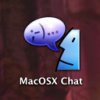
Vote for the new icon for our chat client
- Thread starter edX
- Start date
Inline_guy
Dockboy
I am with you gatorparrots, for as many creative types that are around here, I expected something more. I think they all look rather cheesy, and none of them look professional.
That said, I think there are some really good ideas among them, that need focused. No hard feelings. I think it is neat seeing the Macosx.com community get involved!
Matthew
That said, I think there are some really good ideas among them, that need focused. No hard feelings. I think it is neat seeing the Macosx.com community get involved!
Matthew
Inline_guy
Dockboy
Who's genius?
Matthew
Matthew
serpicolugnut
OS X Supreme Being
None of them are great, but 26 is the best of the bunch...
dlloyd
Official Pianist
You, Inline_guy!Who's genius?
edX
mac shaman
considering that the submission process for this was over a month in the making and there was plenty of suggesting and reworking that took place during that time, those of you who suddenly want to get critical can just keep it to yourselves as far as i'm concerned. you missed your chance.
i think we have some excellent choices and can't go too wrong no matter which one is chosen. so vote, don't vote, design your own and put in your copy, but lay off criticizing these artists who spent their time and effort to create these choices.
I personally want to re-thank everyone who contributed to this project. it may sound cliche, but you're all winners in my book.
Inline_guy
Dockboy
dloyd mine is up there already. With no votes! (excluding my own vote!) :-D
Sorry if I came off critical, maybe it is the fact that I am trapped by all the snow here, but this is what I felt. I just think we have more talent here than people are showing.
If I came across critical it is because I expect more from us as a colective. And I am guilty too. I submitted one, that I had made awhile ago that I use for another chat client. And I do think there are some good ideas, that need polishing.
I voted for nine. I think it is good. I think that twelve is got a nice look about it as well.
The thing is I come from an Art school where you are taught to speak your mind about other's design. This is probably not the time or the place for it. Ed, I agree that it should have been keep in the design phase. Sorry again!
Later!
Matthew
KrinkleCut
crispy subgenius
I voted for 19 but it's getting crushed by #9. Scalability is everything. I don't like having my icons at 64x64 just to tell what they are.
edX
mac shaman
yea, i wasn't so much trying to single you out Guy as i was speaking in general. i have also had additional thoughts about how some of them could be improved since we closed the thread but i figured that phase is over for now.
but there is nothing that says we can't do this all over again in awhile. the client itself as well as the original source code from which it is derived are both going to be updated from time to time. these will be oportunities to try another one. we could even release it occasionally with nothing more new than a new icon. every 3-4 months for a change like this seems reasonable and that way plenty of our artists would get the opportunity. and of course, anyone could always hang on to an icon they liked and keep using it. i'm still using the one that chevy and i designed for the 1st release that only lasted for a few hours and was an in house release only.
so yea, if you've got ideas, hang on to them. there will likely come another time and place where voicing them will be appreciated.
Ricky
Registered
Any specific ones that fit this description?Originally posted by Inline_guy
And I do think there are some good ideas, that need polishing.
porteous
East Anglia branch
Only just caught up with this poll. Whichever gets chosen, it's got to work at a smaller size than shown here, and be good enough to be seen with all the other icons I can see in my dock right now.
For me, the only one that fulfills those criteria is No 6 - and, at the same time, evokes just a little of the spirit of the 'old' Mac - that we all know and love.
Anything which utilises a 'Jaguar' design presupposes that all users will be using Jaguar - which of course they won't....
For me, the only one that fulfills those criteria is No 6 - and, at the same time, evokes just a little of the spirit of the 'old' Mac - that we all know and love.
Anything which utilises a 'Jaguar' design presupposes that all users will be using Jaguar - which of course they won't....

