Ok, well i'm 18 now, and since about 95', i've used Windows, and Come to learn this that and the other. But i saw OS X, liked what i saw, and well, jumped aboard!
But being, underlyingly, a "windows user", i often find things GUI wise, that seem weird or wrong, and i guess this is the right kinda time to point them out, and discuss!
Since purchasing my iBook, and picking up little things, and being able to use OS X "competently", i've found some cool things, i wished i had, had on my XP Machine! Personally, i think Aqua Looks Better (hence why PC Doesn't even have Luna!), but there are still many things within XP, i do Like!
1) Toolbars - I love on X, on how Customizable they are. You are free to drag and drop things in and out, Whereas, with XP, you always felt limited, and means to organise the toolbar was more complicated (not to say i couldn't do it, but it's by no means easy, by comparison) Being able to see the toolbar, in "Customize toolbar Mode" on X Seems So much more "user friendly" IMO. Whereas, in the shot on XP, you can see, it looks far from easy, upon first impression. You have Select the icon (+text), then use the up and down arrows, to shift the icon around, or add / delete it. Taking GUI design and such into consideration, i consider it bad design, that to move icons to the left of the Toolbar, you have to use the "Shift Up" Button? Somehow that doesn't make much sense really. Comparably, on X, you simply Click and Drag it left or right, not have to work out "if i do this, it'll *fingers crossed* go there".

2)Windows Media Player - Yes, i know Essentially its not "GUI Design" orientated, but i like where M$ are @ with it. Often you hear X users quoting within flame wars, how they can do "this, that and the other" without having iTunes open. Well, i don't know how many of you have XP up to date, or care to try BETA Stuff?! Windows Media Player 9, for me has brought the same kinda feature, integrated to the toolbar, that allows you to control you media, just like the Dock Popup with X. It Really intergrates well, and allows you:
Pause / Play
Stop (where, WHY isn't Stop apart of iTunes, unless you open an iTunes window, and select a playlist that is not playing?! that really bugs me! Can someone explain that?
Previous / Next Track
Volume
Mute (More handy than you realise, when its there!)
Also, Maximize (Because the Taskbar player comes into play, if you minimize WMP, and activate the taskbar player.)
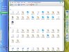
When you're playing Media, a Popup window which is, not very optrusive in my opinion, pops up, and display Track information and such (i thought that was a neat little extra), and Also, if the Track is playing, or even paused, On Mouseover of the M$ Logo, it displays the track which is paused, in another little popup like window. (Screenshot Attached). As you can see, it fades in and out too! Pretty Cool, eh?!

3) Show in Groups. This is something i like, which i miss, in X. yes, if you switc to Detail view, you can do a sort by name, or by File type, etc. But, i find this, a far better way, (obviously in Windows, you can do the same Detail View Sort) because its far easier to read the files, often, you find in detail view, it seemed "Crammed" and it makes things hard to read. But with the feature, you can distinguish files within a directory, by First Name, Total Size, Comments, Type, and Free Space. This is a neat feature, that GUI wise, helps a user to not just find files, but to organize their files.

4)Recycle Bin - Why in Windows, is it on the DESKTOP, alone?! That Does bug me, i love having the bin there in the dock, allowing me to dump stuff from many sources EASILY. And Yet in Windows, i either have to minimize Windows, or a particular one, If i can remember where i last left the bin?! I'd like to see the Bin implemented into the taskbar, if they can implement the WMP App into it, i am sure this too will be done with the next Edition of Windows, it makes a Hell of a lotta sense to me! For me, the GUI of Windows means a lot, using X, and XP, i find it just, to modify things a lot, to fit the kind of enviroment i want, and luckily, Windows Does offer a lot of Customizing, which allows not only 3rd part Apps, to extend the way YOU work, but little inhouse "extra's" out of the box, or PowerToys. For me, i made a new toolbar, and have the Recycle Bin in the Taskbar, which does the job it should, but it bugs me, why M$ Decide to leave that on the desktop, and shift more commonly used links, ie "My Computer" Away from the desktop?! Maybe they Forgot?!
I had loads to write about, maybe i am going off on a slight tangent here, but i felt just to post in this discussion, because being natively a "Windows User", my opinions differ (i imagine!), from the majority around the place! Sorry if that i wrote wasn't exactly on topic, but it does validate some points and such, right?!
Neyo

")